Flint

The word “restaurant” doesn’t do Flint justice. It isn't just a place where you go and get fed. No, it's a place where you go and get energized by the lighthearted vibe, the passionate people around you, the imagination of the menu, and the flawless quality of every last bite.
When we began working with the Flint team on their brand identity, we knew we had to create something that brought this energy to life in every touchpoint.
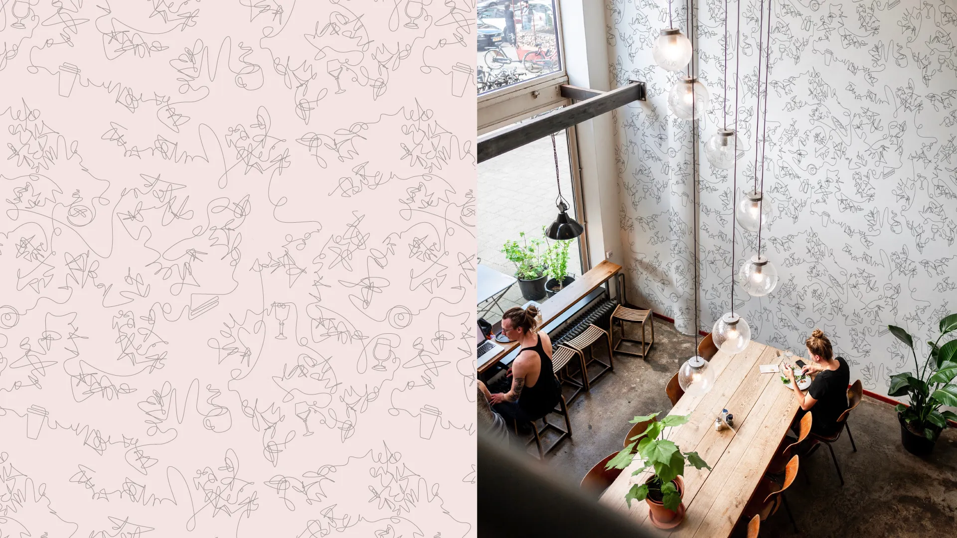
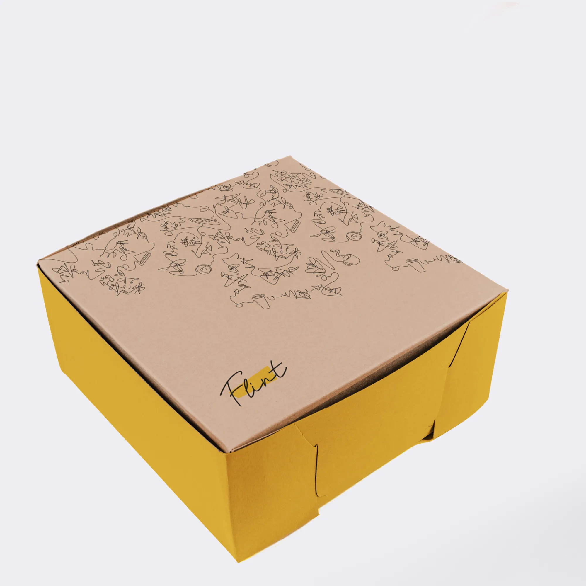
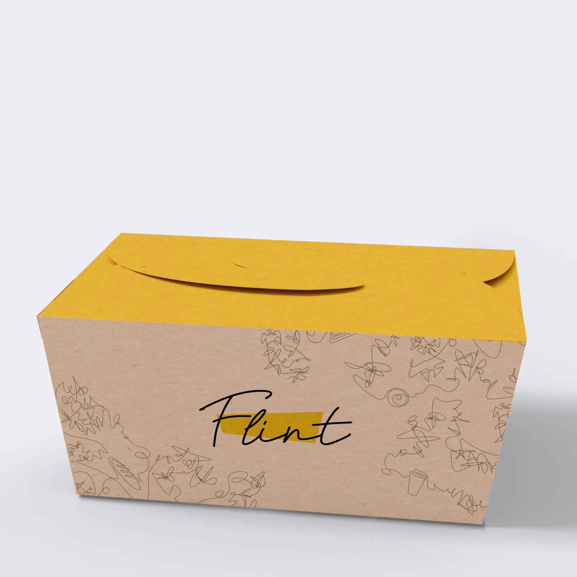
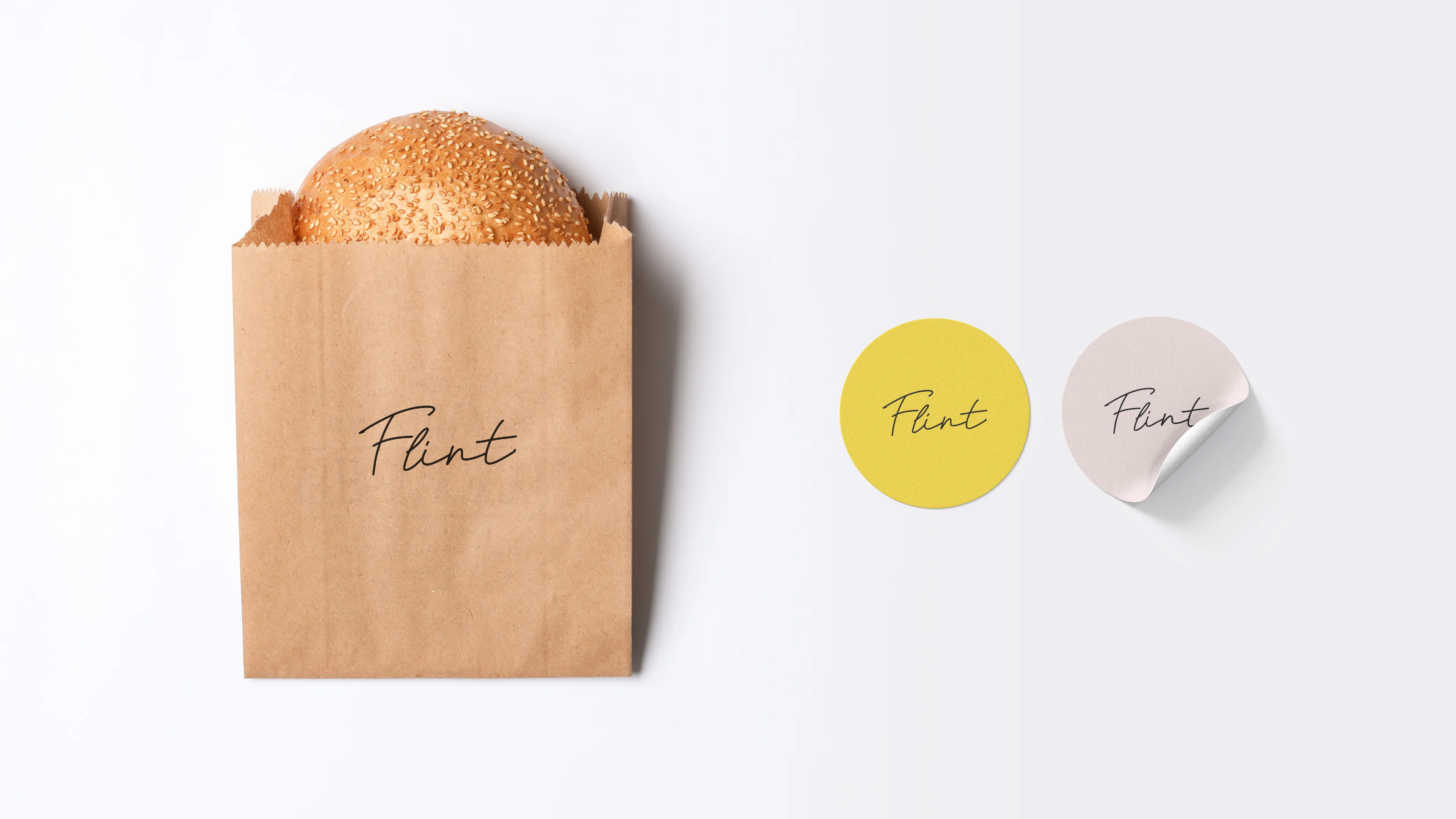
To that end, we developed a vibrant color palette that’s warm and inviting as well as hip and fresh. We then paired that color identity with an unpretentious scripted logo wordmark and a series of playful icons meant to highlight that nothing about this place takes things too seriously.
All of these elements combined in myriad ways when we worked on packaging design (a true feat for a restaurant with such an eclectic mix), custom wallpaper development, and social media asset creation designed to help drive awareness to the downtown Buffalo crowd.
Mr. Smith was chosen as agency partner responsible for Brand Identity, Menu & Stationery, Collateral Design, Packaging, and Interior Branded Elements.